When you click on links to various merchants on this site and make a purchase, this can result in this site earning a commission. Affiliate programs and affiliations include, but are not limited to, the eBay Partner Network.
i'm glad you shared this. if ALO has learned anything since becoming a 0x WDC over the last 11 seasons, it had better be to remember where his bread gets buttered.
in other words it was convenient to throw honda under the bus and he's apparently learned to keep the message about mclaren positive. something button was able to do even when the car was completely *****.
Seb may be a petulant hot head but he never throws the team under the bus. At least I've never heard him do it. I have a feeling if next year is not what Fred expects we will be hearing from him about it. I hope not and I hope he has learned his lesson. I'm skeptical doe, just like with the FIA and new regs. I'll believe it when I see it.
Looking at that, I do think the new logo is better. I didn't care 1 way or the other when it first came out but on that graphic it just looks better to me. But eh, that's just me. Your mileage may vary
Also worth adding that Pirelli only have the superhard in case the teams find gobs of downforce over the winter. They don't actually think it will be used but is a just in case tyre.
When I first saw it I didn’t like it, but on the second day I changed my mind. The same thing happened with Chase Carey. I know this because he told me. He wasn’t sure and then he was. The thing that people miss when they say we should stay with the old Flying F logo is that it was not designed for the modern world. It was drawn up in 1994 – 23 years ago, at a time when we didn’t know what pixelate meant and we could not imagine the world we live in today. As I understand it, the primary reason for the change was that you cannot embroider the Flying F1, and it doesn’t work digitally, because all the speed lines get blurred. In addition, it doesn’t work in 3D, which in this day and age means that it is utterly useless. I think that when people see the different things that this logo can do, they will understand why there had to be a change. As I wrote somewhere in the last few days, back when the old logo was invented branding, for the folk of F1, was something you did to cows…
In the mid-1970s, relations between Egypt and the Soviet Union had become strained, and Soviet advisers were ordered out. The Soviets had provided the Egyptian air force with MiGs since the mid-1950s. Now, with their traditional source out of the picture, the Egyptians began looking west. They turned to United States companies for parts to support their late-model MiG-21s and MiG-23s. Very soon, a deal was made. According to one account, two MiG-23 fighter bombers were given to the United States by Egyptian president Anwar Sadat. The planes were disassembled and shipped from Egypt to Edwards Air Force Base. They were then transferred initially to Groom Lake for reassembly and study.[3]
The MiG-21s and Shenyang F-7Bs were called the "YF-110" (the original designation for the USAF F-4C), while the MiG-23s were called the "YF-113".
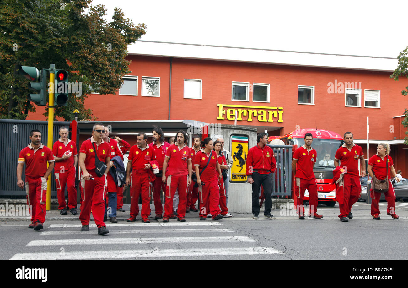
Those show cars are usually a mix-match bag of stuff. But I'd venture to say its a C32 "mostly".
Yeah the 32 looks closer. Must have updated sidepods doe. They look a little different from the launch spec. As you said tho, the show cars are usually a mix of all sorts of crap. You can see a tiny bit of the step in the nose.
Yeah those are the updated sidepods. They debuted them halfway through the season.
Hamilton posted on Instagram footage of a dramatic clash between Nico Prost and Nick Heidfeld which happened at the 2014 Beijing ePrix, and which he mistakenly believed had just occurred!
In his message, the Mercedes driver lashes out at Prost, accusing the Frenchman of 'dangerous driving' and advocating his ban while hoping Heidfeld was okay.
I guess better late than never, right?
Side note. 2003 Spanish GP on. Commentators prior to race talking about 1 engine rule in effect for 2004 and that Merc was spending 20 million a year on the V10s. They were amazed by that sum. 15 years later its increased 10 fold lol.
I mean, or make it all red. Just stop with the ugly white/red garbage.
that I agree with. Less white the better, but I think Marlboro will be calling the shots there for several more years as they own all the branding on the car the other sponsors negotiate through them.
that I agree with. Less white the better, but I think Marlboro will be calling the shots there for several more years as they own all the branding on the car the other sponsors negotiate through them.
Yeah, I know why, it just saddens me. How long is that deal? Seems like its been forever, even the 641 I posted is Marb sponsored.